


Montfort Identity
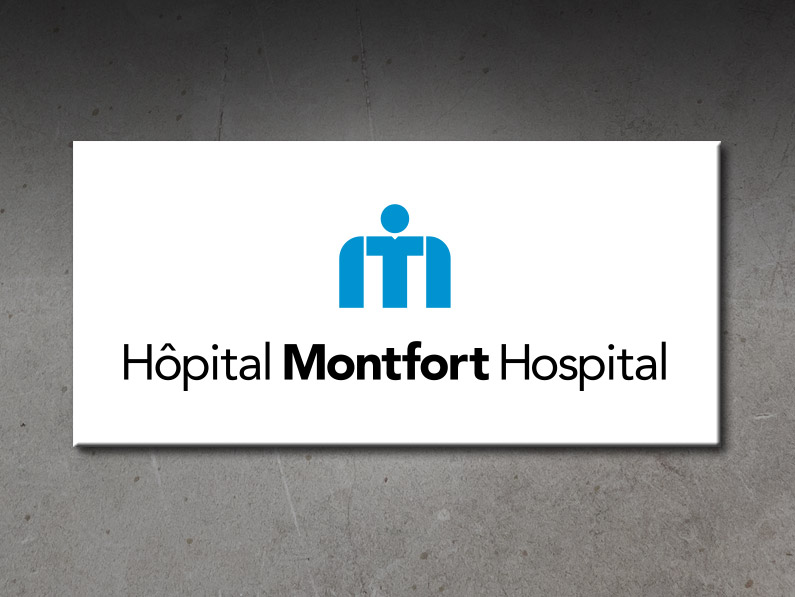
Hôpital Montfort | Montfort Hospital is a Francophone academic health care institution located in Ottawa, Ontario. In 2007, Smith was hired to create a branding program that would unify the graphic treatment of the various hospital logos, and make it easier for staff and suppliers to use them. Prior to the redesign, hospital logos could be found using an assortment of fonts, various shades of blue, and plenty of artistic licence applied to the size and treatment of the “M” icon. People were unsure which version of the logo was the correct one to use. Smith set out to fix that. We were instructed to keep the well-recognized “M” icon. We established a Pantone colour (and CMYK equivalents) for the corporate blue. We selected a new font that reproduced clearly at any size (from pens, to forms, to exterior signage). The logo needed to work bilingually, and unilingually, and we needed to create versions specific to the hospital, the hospital foundation, and the hospital auxiliaries/volunteers. That’s a lot of logos! To make this identity program something people could navigate, we developed a file naming system that made it possible to identify the logo type, language and colour — simply from the file name. Then we produced a concise four-page visual identity guide (in both languages), that explained the new program.
SmithGDS welcomes the opportunity to discuss your advertising and design needs. Give a call or send us a message today!